Case study 01 · Web3Connect.com
Zero-to-one platform build & launch
An extensive B2B reviews platform I scoped, designed, built, refined & operated solo.
The premise
Web3Connect is a reviews marketplace for the blockchain industry — conceptually G2 or Clutch, but specific to one sector. Service seekers find and compare industry partners; partners claim and upgrade their listings; reviewers leave structured, verified feedback.
It was also an experiment: could an solo founder, using AI as the engineering team, design & launch a commercial-grade platform?
What I designed and shipped
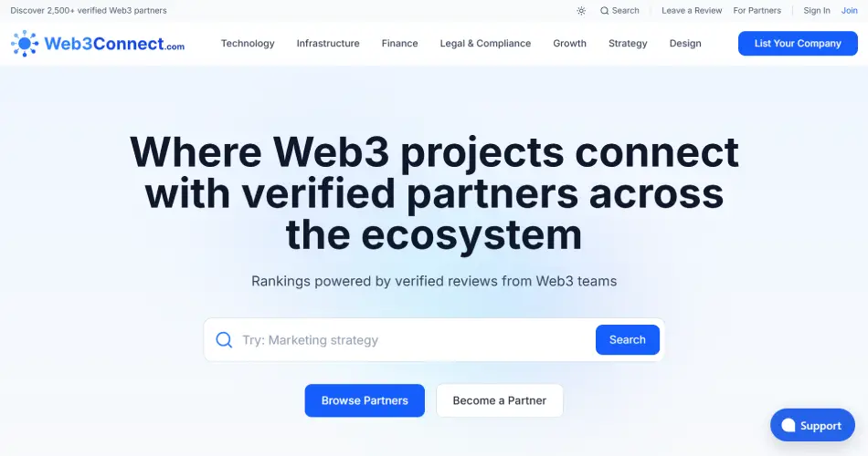
Four web applications (and a background worker), all responsive web with dark mode theme — plus an email design system supporting the customer lifecycle.
Public marketplace
Search and filter partner offerings; partner profile and offering detail pages; reviews display; ‘similar partners / offerings’ lists; claim-profile and upgrade calls to action.
Review submission flow
Partner and offering search, multi-step submission, structured ratings alongside free-form feedback, LinkedIn-Verified reviewer authentication, and save-and-resume functionality.
User/Partner dashboard
UI changes depending on who the user is (service seeker vs partner) and what plan they’re on, and always shows them one clear next step.
Admin dashboard
Back-office for all administrative tasks: moderation of reviews and partner applications, AI-powered new partner profile creation, platform metrics, user management, etc.
Background worker
Ranking recalculation, cache management, email sending, and other background tasks. None of it is visible to users, but everything else depends on it.
Email design system
Transactional, broadcast and event-triggered lifecycle emails. Responsive across clients, light and dark theme support, content variants based on user behaviour tagging, A/B variants, and a reusable component suite for guaranteed consistency.
Project timeline
-
Jul–Oct 2025
Research and definition. Analysing how the industry handled partner discovery & vetting, building the partner category structure and then testing it against a major industry conference vendors list, crafting a fair monetisation model, designing the ranking formula, writing the specification and database design, and building interactive prototypes.
-
Mid-Oct
Build starts. Build methodology established (roadmap + sprints), technical decision making logging, key integrations written.
-
Day 4
Database fields hallucination. Over a hundred fields the AI had invented. I rolled back and implemented stronger guardrails.
-
Day 11
Split into four apps. A significant architectural decision made early to split the project into four apps plus a background service & shared components library rather than the monolithic app the boilerplate defaulted to. This also let me work on 4-5 apps at once (via worktrees).
-
13 Dec 2025
Launch, eight weeks after the first line of code. Aggressive feature prioritisation & staging to achieve early launch.
-
Jan–Mar 2026
Tidying up, and chasing adoption. Duplicated code merged into shared libraries, speed and caching enhanced, and a two-person team running partner outreach while I built the admin tools they needed.
-
Apr 2026+
Auto-pilot. Lifecycle campaigns, admin automation and AI-agent native content. Organic traffic still growing without active promotion.
From prototypes to a production five-app platform
Lines of TypeScript
Commits — 929 of them before launch day
Architecture decision records, plus 105 build logs
Unique visitors (by Sep 2026)
Pageviews, 3,211 of them from AI agents
Deep Dives
A fair partner ranking system
My research showed that competitors sold the top spots in search results. Not only was this not scalable, but it also eroded customer trust. Instead I built a quality score algorithm using on-site verified reviews & off-site metrics, limited how money influenced it, and published the formula transparently so anyone could check it.
Useful if you want to see: commercial thinking and competitor research.
Four apps in eight weeks
Tech stack selection, a boilerplate review, prototyping, an AI that invented a hundred database fields, running coding agents in parallel, and the cost of building fast.
Useful if you want to see: technical judgement with the downsides included, and how I handle problems in live systems.
When almost nobody left a review
Traffic grew for nine months but hardly anyone reviewed anything, which is the one thing the business model needed. This deep-dive reveals my diagnosis of the blockers, and the solutions I implemented to address them.
Useful if you want to see: how I measure things, lifecycle and growth work, and an honest account of something that didn’t work well enough.
Design system before mockups
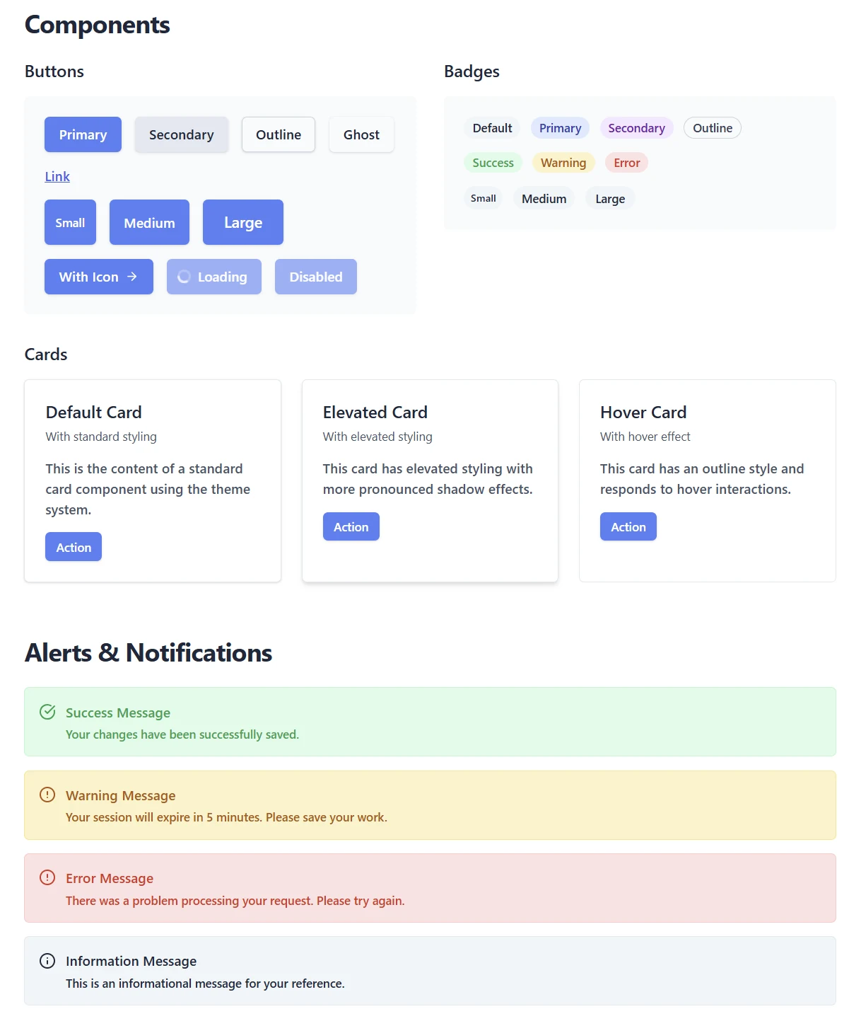
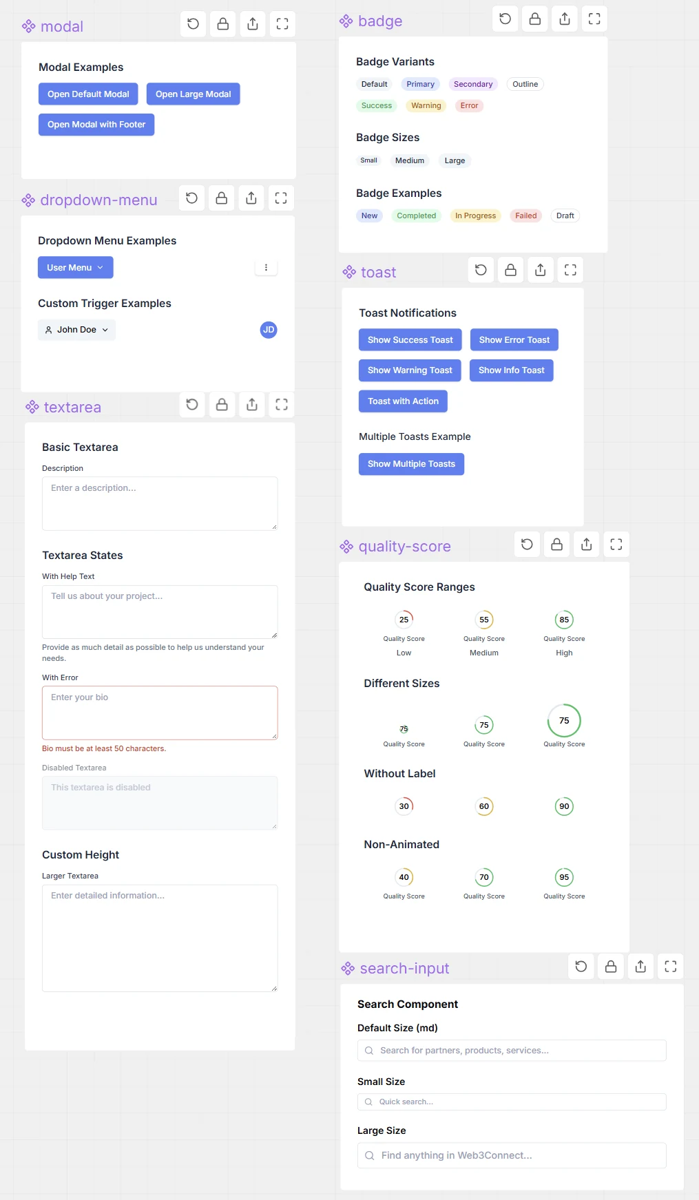
For Web3Connect.com I wanted to launch quickly and reduce hallucination risk during the AI-assisted build phase. I was able to achieve both objectives by using frameworks Claude Code was already trained on (shadcn/ui and Tailwind v4) as the foundation.
I extended this AI-native foundation to establish a comprehensive design system in code before I prototyped any screens leveraging it.
The adaptive dashboard
The user dashboard had to facilitate the objectives of three user types - service seekers, reviewers, and partners. Partners could be on a free or paid plan, which influenced the visibility and complexity of features such as analytics & visibility boosting. I designed the user dashboard in a modular fashion to allow partner-level functionality to extend the base service-seeker user functionality.
- Users are tagged based on what they were doing when they signed up and what they click, and those tags also change what onboarding emails they get.
- Banners, menu items and the main call to action change depending on who you are and what plan you’re on.
- There is always one obvious next step to the next most valuable action for the platform: leave a review, claim your company listing, upgrade, or buy more visibility.
I built a prototype with a switcher to visualise the different states before building anything for real.
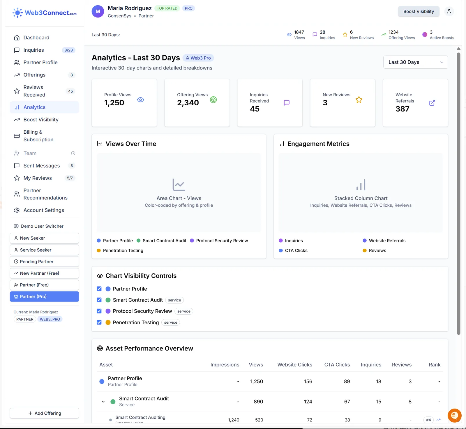
Post-launch, I enhanced the user dashboard functionality to highlight a partner's current rankings, and how far behind the top supplier they were (to encourage them to get reviews) — see the flywheel deep dive for more on that.
Designing for AI agents as well as people
More and more of the traffic to a site like this is an AI assistant doing research on someone’s behalf. That visitor can’t see layout or design at all — the only thing it responds to is how clearly the information is structured.
So instead of treating AI traffic as something to block, I built it a proper interface: an index file
at /llms.txt describing what the site contains, plain-text versions of every public page, and
a search endpoint built for agents rather than web browsers.
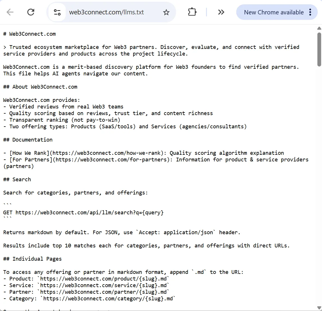
/llms.txt index. Adding .md to the end of any page address
returns a plain-text version of it. Anything a customer wrote is wrapped in a warning, so an AI reading a
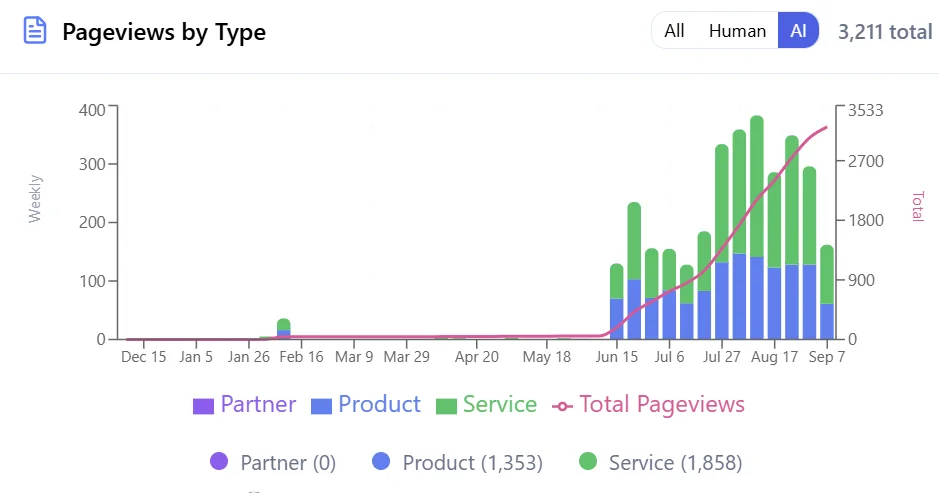
review doesn’t mistake it for an instruction.Almost nothing used it for six months. Then this happened:
Knowing when to stop
About a year in, I considered whether to keep investing and decided against it.
Three reasons:
- people are increasingly starting research in AI chat rather than a search engine, which undercuts a discovery site;
- crypto industry vendors were apathetic; and due to this
- the monetisation model was difficult to defend commercially without review volume.
After months of initiatives I made the decision to stop. The platform still runs autonomously, and I’m putting my time into a team that can leverage my skillset. I’ve included this deliberately – deciding when to stop spending time & money on a product is a real commercial judgement, and probably more useful to know about me than another success story.
What I learned
Four things
- An eight week build only worked due to clear specs. The PRD docs, database design, category structure, design system and prototypes took time to get right. AI speeds up the building. It doesn’t make the decisions.
- Understanding the limitations of AI – especially context windows & targeted context inclusion – and planning guardrails to enforce standards is essential to avoiding buggy outcomes through hallucination.
- A new kind of visitor turned up and I nearly blocked it. AI agents went from nothing to 3,211 pageviews. Building them a proper interface took a day and it’s now the fastest-growing traffic type on the site.
- Knowing when to stop is part of the job. Building something on my own in eight weeks was the easier half. Looking at the evidence and deciding not to invest further on it was the harder and more useful call.
Going deeper
The three deep dives cover the decisions in full: how the ranking works, building it in eight weeks and what that cost, and why almost nobody left a review. The admin tools and email system aren’t publicly visible, so I’m happy to share my screen and show you those.